

Refer to figure or CAP 698 file 4.6.
Given the following information, what is the tyre speed limited take-off mass for a Medium Range Jet Transport (MRJT) which is scheduled to depart from Madrid airport?
Airport Elevation: 1998 ft
OAT: +31°C
Wind: 10 kt headwind
Tyres: 210 mph
Flaps: 5°
Power Management Computer (PMC): On
Refer to figure.
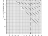
When calculating take-off speeds, we must be careful not to exceed any limit speeds. For example, we must rotate and leave the runway before exceeding the Maximum tyre speed otherwise we risk bursting the tyres. We can use performance charts to calculate the maximum take-off mass we can accept for the maximum tyre limit speed, as in this question:
- Enter the bottom of the chart at the OAT of +31°C
- Continue up to the pressure altitude of 1998 ft (the 2000 ft PA line will suffice)
- Draw a horizontal line to determine a mass of 80 900 kg
- Determine the correction for 210 mph tyres; - 9600 kg
- Determine the correction for 10 kt headwind. We are told to apply a correction of +400 kg per kt, so multiply this by 10: +4000 kg
- No correction for Flaps 5°
- No correction for PMC OFF (as we are told the PMC is ON)
The final value is then 80 900 - 9600 + 4000 = 75 300 kg
Your Notes (not visible to others)
This question has appeared on the real examination, you can find the related countries below.
-
Germany1
-
Slovakia1


